Tuesday 9 December 2014

Black and White + One


In CyberARTS this week, we worked one our "Black and White + One" art piece. The assignment was to get one of our garden photos and turn it to black and white, also to add some color to it wit Adobe Photoshop.
 For my photo, I used a few layers. One of the layers were the actually photo with color. The second layer was the black and white, to give my photo that effect. Next I decided to erase the black and white where the purple of the original photo was to add my "+ one ". Finally, I increased the contrast to make the purple stand out more.

Wednesday 26 November 2014

Black and White Garden Photo Assignment

Original Photo
This is the original photo that we were asked to create Black and White for this assignment in CyberARTS this week. The assignment we were suppose to do was to make this photo black and white in 3 different styles. I used the black and white mask in adobe photoshop for one of my 3 photos, and the other 2 I used the gradient map also on adobe photoshop to make them black and white, but in different levels of it.  
Black and White Mask
For this effect, I used the Black and White mask along with green channel. These effects made the wall stand out more than the the flower, which gave the photo a more dramatic effect. Which I really enjoy.

Gradient Map
For this black and white edit, I used the gradient map on adobe photoshop. I used more black on the background to emphasize the flower. I also made the flower brighter with the gradient map to make the flower the main focus, in other words, emphasis
Gradient Map
Lastly, for this edit I used the gradient map again, but this time to slightly brighten the photo up. I increased the white in the photo for brightening the photo.


~ Miss Awesome <3

Tuesday 4 November 2014

Realistic Chess Piece

This week in CyberARTS we were asked to draw a realistic chess piece with a background and the chess piece as the main point. There is not much to say about the picture so until my next post, bye!

~ Miss Awesome <3

Tuesday 28 October 2014

My T-Shirt Design For The Lakeshore C.I Skills Challenge

This week in CyberARTS, we were asked to create a T-shirt design for our school's "Technological Skills Challenge.  The "Technological Skills Challenge" is how well are your skills for cosmetology (makeup, beauty), Auto (fixing cars), Wood shop (wood working) and culinary works (cooking).

My t-shirt design is based on a light bulb. I chose I light bulb because it represents ideas and thoughts. Originally my rough copy, (pencil drawn picture) was going to be the light bulb with the writing that reads our school name initials and the skills challenge. After trial and error of recreating it with Adobe Illustrator, I decided to put the writing on the outside and make the bulb one color, same as the writing. I chose blue, black and purple as my colors for the light bulb.

To create my final copy of the T-Shirt design for the skills challenge, I used the program Adobe Illustrator. I used the pen tool to outline my light bulb shape and used about 5 layers to make the final copy. Also, I scanned the pencil drawing photo on the computer so I was to outline the bulb.

For elements and principles of design, it includes shape, line and color. Shape is in the bulb, line is in the text and color is in the colors I chose to decorate my bulb.

Overall, I am very happy with the work that I have created. It was very hard to make, but at the end it turned out better than my original plan (pencil drawn picture).  I think the participants of the Skills challenge will love my shirt design (if it gets chosen!) Wish me luck!

Thanks for reading :)


~Miss Awesome<3 

Tuesday 14 October 2014

Garden Photography Project ; Part Two, The Photos

Sunflower

Orange Flower

Green Tomato

Purple Flower

Pink Flower

Radish

Magenta Flower

Black and Green Flower

White and Green Flower Field

Black Mushroom


(Part One with the writing about the photos is in the post below)

~Miss Awesome <3

Saturday 11 October 2014

Garden Photography Project ; Part One, The Writing


In CyberARTS this week, we were asked to go to our school garden and take photos of things that catch attention to our eyes. We were allowed to take 40 pictures, but in partners, 20 for each person. After, we were asked to narrow the pictures down to our top 10 for each partner. Once we completed that, each person had to take that top 10 and edited them in Adobe Photoshop. For most of my photos, I adjusted the brightness, contrast, saturation, vibrancy and cropped a few. Here are my 10 Garden Photos that I will explain in detail for each one, Hope you enjoy!


This photo is a picture of a Green Tomato. To take the photo, we angled our camera to the way we wanted it and focused it so we could get the sharp and beautiful colors. For editing it, their are not any major differences because I wanted to keep the natural green colors of the photo. I adjusted the brightness to emphasise the tomato, also so it can be the main focus of the photo.

This purple flower, was edited with contrast and brightness. I brightened it because I wanted the background to be lighter and I added contrast so the purple flower would stand out. An art principle for this photo again would be emphasis because the purple stands out from the green. We also focused the camera to get the little details of texture in the flower.

This beautiful sunflower is my favourite out all the photos. This photo is extremely focused because you can see the really small details like you would in reality when you are stand next to the flower. For editing purposes, I cropped some of the left side because the lighting was a little off. I lowered the brightness because I didn’t want the sunlight (the white part) to take away from the beautiful flower. Some contrast was also added. This photo has the element of texture because its like you can reach in and touch it.

This photo is a picture of some green leaves and some really pretty white flowers. This photo was brightened and contrasted. I brightened the picture because I wanted the green to stand out bright and bold. The contrast was also to blur out the background of the bricks to make the focus on the green. Although I faded the background a bit, I still wanted to show that there was something there to wrap the photo up. Some principles and elements of art are space and emphasis, Space because of the background being slightly blurred, and emphasis because of the green being the first thing that the eye sees.

This photo of the magenta flower was cropped, brightened, and contrasted. The crop was because there was a lot of things distracting from the main focus of the picture, (The Magenta Flower). This photo has space and emphasis as some elements and principles, Space because of the grass in the background emphasising the magenta flower.

This is a black mushroom, I added contrast to emphasis the black mushroom because it’s a little too hard to see it. The focus on this picture is excellent because you can see the little details of the mushroom, like its lines. I decided not to crop out the leaf because the photo needed some color and I thought that it would look very nice with the main colors in this photo, brown and black.

The next photo I took was of the orange flower. This photo was saturated, brightened, slightly contrasted and vibrancy was also added. I brightened the photo because the original picture was a little dark. The saturation, vibrancy and contrast was just again to add a bright and fun feeling to the photo. This photo also has radial balance because it has a fair balance of color and shape on each side.

This photo is a radish. I like this photo because we got a great focus and angle so you can see the little textured details. I contrasted the photo because I wanted the pink of the radish to be the main focus of the photo. The colors in this photo are a perfect combination of green, pink and brown. Plus, the photo has the rule of thirds because the actually pink radish part is on the side, the middle of its pink/green stem is in the middle and the top of the stem is on the left side.

This pink flower was not brightened (meaning I lowered the brightness). Vibrancy and saturation were added to make the pink flower stand out the most. The element of space is shown in the photo because the background of bricks look far, making the pink flower look closer to us. The focus in this picture is amazing because you can the little details of the petal.

This last photo is the green and black flower. I increased the brightness because the photo was a bit dark originally. After, I also added some contrast to make each flower stand out. The focus is very good in the photo because you can see this white stuff around the flower which is really cool. The elements and principles in this photo are texture and space. Texture because it looks realistic and it looks like the real thing if you were to touch it, and Space because the background looks farther and makes the actual plant pop out closer.

These are my ten photos, I hope you enjoyed looking and reading about them!


(Part Two with the photos is right above this post!)

~Miss Awesome <3

Wednesday 8 October 2014

The Third Class Carriage by Honore Daumier; Re-Creation Assignment


                                          "The Third Class Carriage" by Honore Daumier

This famous painting by Honore Daumier is called "The Third Class" Carriage. It was named that because the people on the train are seated in the third class carriage. The emotions shown in this photo are love and sadness. Love is shown by the mother holding the baby and sadness is shown in the facial expressions of the passengers, yet they still have a noble emotion because they are sitting up straight and being professional even though they are sitting in the back. The third carriage in the train would have the coal exhaust enter the carriage giving the passengers an obvious reason to be upset. This picture is not extremely realistic or imitated to reality because a regular human being does not have an outline around them shaping there body. The elements and principles in this original painting are emphasis, space and line. Emphasis in this painting is the woman in the front wearing blue. It's emphasized because all the main colours in the painting are dark yellow and brown, to see the blue just popping out is emphasis. Lines are all over this painting because of the outline of the passengers, the detailed facial lines and the grid that you can see slightly in the background. Grids are used to help artists draw faces and distort painting and drawings. Space is because in the background the passengers start to fade because of how far they are.


                 CyberARTS re-creation of "The Third Class Carriage" by Honore Daumier

  For this assignment, we were asked to re-create "The Third Class Carriage by Honore Daumier. This re-creation was made by our CyberARTS year one class. To re-create Daumier's painting, we used compressed charcoal and willow charcoal. The difference between the two is that compressed is thicker lines and better for layering. Willow charcoal is better for thiner lines and little details. We tried to imitate Daumier's painting and overall it turned out well because we had most of the facial details, the main items (e.g the baby and the basket) and the painting's details. Our re-creation had most of the elements and principles that the original painting had, like line and emphasis. It had line because we outline the passengers like Daumier did and we also got the facial details with line as well. The emotions in our re-creation is the same as the original painting by Daumier, Love because of the mother holding the baby and Sadness because of the facial expressions on the passengers.

~Miss Awesome <3

Wednesday 1 October 2014

Duck Outline Project

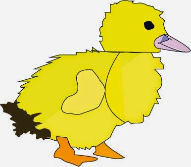
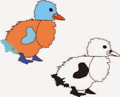
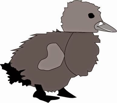
This is the original copy of my Duck Outline project. The purpose of this project was to take a picture of something that has a special meaning to you or just something you think is interesting to you, and outline it. I chose the duck because it has special connection to my life. When I was younger, around 2 or 3 years old I used to walk like a duck. Since I speak Arabic and my parents do as well, they called me "Duck" in Arabic which would be Bata. Also, I chose a baby duck because obviously when I got my nickname, I was a baby. The elements and principles included in my outline are colour, emphasis, and line. Line is there because the lines I created with this outline are curved, straight, and zig zag. So it has a variety of different lines. Emphasis is shown in my black and white version of this drawing, the black stands out on the white background because its darker. Color is shown on the 8 colourful ducks, because there are so many different colours in that specific outline page. To get technical, I used the pen tool in Adobe Illustrator. The pen tool is the main resource in Adobe Illustrator during this project we were assigned. It outlined my duck and made that shape more realistic. Personally, I had a lot of struggles and problems with this assignment. I had trouble adjust the lines and there textures. Also, I used about 8 layers for my Duck Outline. Layers are the different sections of the outline that are drawn with different layers. An example would be a heart. You would need one layer to draw the actually outline, and one more to fill in the heart with the color of your choice. This process was used for my duck and the details of it. At the end of the day, I am very proud of my Duck Outline, although I struggled a bit at first, I managed to work along and fix my mistakes, to create a wonderful final piece. This is my Duck Outline, I hope you enjoyed looking at and reading my story on how it was made.


~Miss Awesome <3

Thursday 18 September 2014

This is my "Rainbow Thumbprint". I am trying to communicate the message that shows me as a happy, cheerful and confident person. To create my final piece, I experimented with other water colour backgrounds to get my good copy. I struggled to get the perfect salt background, but I managed to take my mistakes turn it into something beautiful. I chose the colours in rainbow because it represents me as a chill, outgoing and fun person. Cool colours, Chill and Warm colours, outgoing and fun! In my writing you notice I added a Canadian Maple Leaf because it shows that although I've been to many countries, I'm proud to live in Canada and be Canadian. Hope you enjoy! :) ~Miss Awesome <3

Wednesday 10 September 2014

Poster Analysis Project

[Value, In this poster, there are a variety of blue’s, which means that there are different shades of blue and that makes it have value as one of it’s elements. The blue’s that are shown are light and dark. The darkness represents the movie Brave as a serious one but the lighter blue’s also add the “fun” effect to it.] [Space, Space is very important part of this poster because the main character is shown in the photo and she is standing on a log. In the background, it shows a forest and as you can see, it starts fading and it gives the effect of distance.] [Texture, The texture in this poster is very realistic. A few examples include the trees and the girl. The trees are very creative because the artist took time to draw them to give us the roughness feel of the tree trunk and the crusty feel of leaves. The girl’s hair has a lot of texture to it. Her hair looks very soft and very real as well.] [Balance, This poster has balance because everything seems to be stable. There is nothing to make the photo seem un-stable because the artist arranged the elements well to give us a feeling of balance when we see the poster.] [Emphasis, Emphasis is a huge part of this photo because everything in the background is blue and green including the girl’s dress. The emphasis effect in this photo is the girl’s hair because it’s a bright orange and it catches attention and makes us focus on her hair.] [Movement, Movement is shown in her hair and dress. Her dress and hair in the poster is designed in a way to show us that they are blowing in the wind, like an illusion.] ~Miss Awesome <3

Saturday 6 September 2014

Typographic Identity

My Typographic Identity is in the shape of a music note because I love listening to music, it makes happy and I enjoy listening different styles of music too. I used the colors below because they are bright and fun. They also represent me as a bright and fun person. I chose the font because I thought it looked good with the colors I chose. The font also matches with the colors because it's both bright and fun to look at. 
~Miss Awesome <3